
A landing page doesn't sell on its own — it either removes the friction between a visitor's interest and a lead, or it adds more of it. There's no universal "converting formula": a structure that works beautifully for a $20 course will fail for a piece of industrial equipment worth six figures. But the principles behind building the right structure for a specific product are shared.
01 When you need a landing page vs. a multi-page site
A landing page is a single page built around one specific offer and one traffic source — not a shrunk-down version of a regular website. The choice between a landing page and a multi-page site should follow the task, not a trend in format.
A landing page fits when: a single specific product, service, or promotion is being promoted, not the company's whole catalogue; traffic comes from ads with a clear message that needs to carry through onto the page; and the purchase decision can be made in one visit without comparing many options in depth. If a company has several service lines, a different audience for each, or is counting on organic traffic across many queries, a multi-page site with dedicated landing pages per line works better — that same logic is covered in more depth in the article on SEO vs. PPC, which discusses a similar choice between promotion formats.
02 Anatomy of a landing page: the required blocks in order
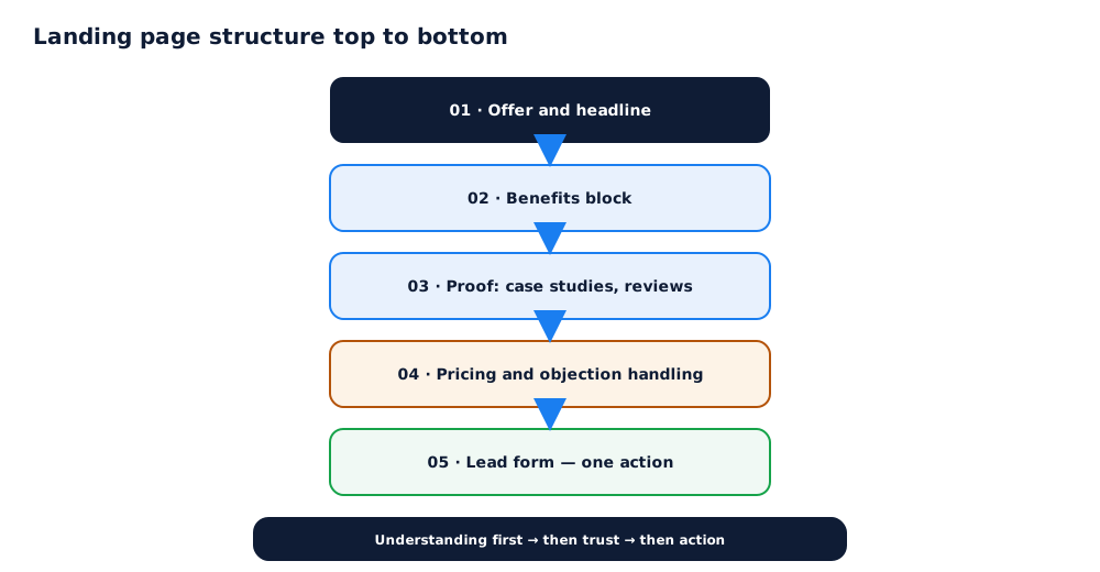
There's no rigid template, but working landing pages share the same basic sequence: answer "what is this" first, then handle objections, and only then ask for contact details.
A typical block order: a hero section with the offer and headline, answering "what is this" within a few seconds; a benefits block — what the customer actually gets, not just a list of features; proof — case studies, reviews, numbers, certifications; a pricing block or a price range, even if the exact figure needs a quote; answers to common objections; and a lead form with one clear action. The exact order can shift, but the "understanding first, then trust, then action" logic holds for almost any niche.
03 Writing the offer and headline
The hero headline is the single most important piece of copy on the whole page, because it decides whether a visitor stays or closes the tab. No design below it can rescue a weak headline.
A working offer is built around one of two approaches: benefit-led, when there's a clear competitive edge that can be stated plainly ("delivery in 2 hours", "3-year warranty"); or problem-led, when the advantage isn't obvious yet or the audience hasn't recognised why they need this, and the headline names the pain the product solves. Before settling on wording, it's worth checking what offers direct competitors run in paid ads for the same query — that quickly reveals which arguments already feel expected and which would actually stand out.
04 One target action and lead forms
A landing page performs worse when it hands a visitor a choice — call, message on a chat app, submit a form, and subscribe to a newsletter all at once. Every extra option splits attention and lowers conversion toward the one goal that matters.
A lead form should ask for only the data needed for that first contact — typically a name and phone number, or a name and email. Every extra field, especially one that isn't essential for a first touch (budget, company, project timeline), filters out visitors; those questions are better asked on a call or in follow-up messages once contact is already made. If the landing page is aimed at ad traffic specifically, it's worth checking it against Google's requirements for ad landing pages, covered in the help article on landing page experience and relevance.
05 Trust: case studies, reviews, guarantees
Even a perfectly worded offer doesn't convince on its own — a visitor wants to see proof the promise is actually deliverable and that other people already got results.
The most persuasive proof formats are case studies with concrete, measurable numbers rather than vague phrases like "boosted sales"; reviews with a name, a photo, or a link to a profile, not anonymous quotes; and explicit guarantees — a money-back policy, delivery timelines, a fixed price — that lower the perceived risk of reaching out. A real example of landing page structure for a product facing high audience distrust is covered in the SaaS startup case study.
06 Speed, mobile, and analytics
Flawless copy is worth nothing if the page loads slowly or is awkward to use on a phone — and that's not a hypothetical concern but a measurable one: a large share of ad traffic arrives on mobile devices.
Three technical requirements without which the rest of the conversion work loses its point: hero section load speed, measured through the metrics Google covers in its page experience documentation; correct rendering of the form and buttons on mobile screens with no horizontal scroll; and conversion tracking set up from day one — without it, there's no way to tell which version of the landing page actually performs better rather than just looking more polished. Tagging traffic for that kind of analysis is covered in the UTM parameters guide.
07 A/B testing and common mistakes
Testing landing page variants is worth doing, but common methodological mistakes make the conclusions less reliable than they look.
The most frequent mistakes: cutting a test short after 2–3 days based on a first visual impression instead of waiting for a statistically meaningful sample; changing several elements at once, which makes it impossible to tell what actually drove the result; and ignoring seasonality — audience behaviour can differ enough between periods that a test run in one month doesn't reproduce in another. If there's no time to build the structure, copy, and testing process alone, this can be handled together with setting up the ads that drive traffic to the page — through Google Ads setup, for example, or as part of a broader set of Grottix services.
If the landing page leads to a signup for a SaaS product, it is worth tracking more than form conversion alone — metrics like CAC and LTV are covered in the marketing for SaaS and IT startups guide.
Landing page conversion rate multiplies directly into the final cost per lead — the higher the page converts, the cheaper each lead is for the same ad spend.
A landing page's structure sets the baseline conversion rate, and from there it can be improved through A/B tests — how to run them properly is covered in A/B testing ads.
Getting the block structure right is only a starting point; figuring out which changes actually raise conversion takes a systematic process of hypotheses and tests, covered in CRO: website conversion optimization checklist.
A landing page's first screen only works when there's a real, validated point of difference behind it — how to write one is covered in how to create a USP for ads and landing pages.
Before reshuffling a landing page's structure on a hunch, it helps to see how visitors actually behave on it — heatmaps and session recordings are the tool for that.
08 Frequently asked questions
How many blocks should a landing page have?
There's no universal number — it depends on how complex the product is and how warm the traffic is. A simple, easy-to-grasp offer needs about 5–6 blocks: offer, benefits, proof, pricing, form, and FAQ. A complex, high-ticket product might need 10–12, because it takes more arguments before a visitor is ready to decide.
Does a landing page need pricing if it varies a lot by project?
Yes, even if it's a range or a "starting at" figure rather than a fixed number. Having no pricing signal at all is an extra barrier — some visitors simply leave rather than spend time on an inquiry just to learn the ballpark cost.
Can a good landing page be built without a designer, on a page builder?
Yes, as long as the structure is followed closely and the copy — the headline, the offer, the arguments — gets real attention. Studies show that rewriting a headline and the copy lifts conversion more than a visual redesign does; good design speeds up comprehension, but it doesn't fix a weak offer.
How many fields should a lead form have?
Fewer fields mean a higher conversion rate — for most niches, a name and phone number, or a name and email, is enough. Every extra field filters out some visitors, so questions like budget, company size, or timeline are better saved for a call, not the form.
How long should a landing page A/B test run before the data can be trusted?
At least 1–2 full weeks, covering both weekdays and weekends, and until a statistically significant number of conversions has accumulated — not until one version looks ahead at a glance. Cutting a test short on day three because of a first impression is one of the most common causes of wrong conclusions.
What matters more for conversion — design or copy?
Copy and the structure of the argument usually matter more than visual polish: the headline and offer decide whether a visitor stays on the page at all, and good design only speeds up how quickly a strong offer gets across. Flashy design paired with weak copy almost never makes up for missing a clear answer to "why should I care".